

How to Read Candlestick Charts: OHLC, Trend, Volume and False Breakouts
 zhan chen
A practical guide to reading candle bodies, wicks and OHLC data, placing patterns in trend context, using volume correctly and filtering false breakouts across FX, stocks, gold and futures.
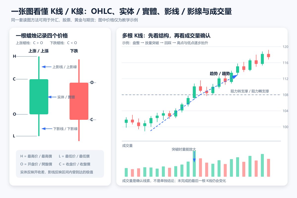
A candlestick chart compresses an entire trading interval into four prices: the open, high, low and close. That efficiency is precisely why candlesticks are useful—and why they are so often overinterpreted. A candle is a record of what price did, not a forecast of what it must do next. Whether the instrument is a currency pair, an equity, gold or a futures contract, a sound reading starts with the market and timeframe, then moves to structure and location, and only afterwards considers volume, volatility and the fundamental backdrop. The FastBull Chart brings those checks into one workspace.
1. Read the information inside a candle—not just its colour
Each candle represents one selected interval, such as five minutes, one hour or one day. Its body joins the opening and closing prices; the upper and lower wicks extend to the interval's high and low. A close above the open produces an up candle, while a close below the open produces a down candle. Colour settings are customisable, so red or green should never replace a direct reading of the OHLC data. On FastBull, the crosshair lets you inspect the timestamp and all four prices for any completed bar. Readers who want a tour of instrument search, chart types, drawing tools and Bar Replay can use the FastBull Chart user guide.
Body size is the absolute difference between close and open; total range is high minus low. A long body records a large net move, not certain continuation. Long wicks show that price explored and then rejected an extreme, but do not prove a top or bottom. Closing near the high suggests buyers finished stronger; near the low favours sellers; near the midpoint implies less resolution. OHLC also omits the order of the intrabar path, so two very different sequences can produce the same candle.
2. Establish the timeframe before interpreting the pattern
A bullish one-minute bar can be no more than a pause inside a daily decline. A large bearish daily bar can still sit within an orderly weekly advance. Lower timeframes react quickly but contain more quote noise, spread effects and one-off order flow. Higher timeframes generally reveal cleaner structure, but they respond more slowly. A practical top-down routine begins with the weekly or daily chart, maps the broad trend and range, and then uses the four-hour, hourly or intraday view for detail. A lower-timeframe signal should not be allowed to erase higher-timeframe evidence without confirmation.
The latest candle also remains fluid until its interval ends. A large body can shrink before the close, while either wick can continue to extend. Always check whether the bar is complete. Market conventions matter as well: equities trade in defined sessions and can gap after overnight announcements; spot foreign exchange is decentralised and daily cut-off times can differ by data feed; spot gold and gold futures do not share the same venue or settlement process. An unusual wick or discontinuity should prompt checks of timezone, regular versus extended hours, corporate-action adjustments, contract month and quote source before any technical explanation.
3. Define trend through swing structure and price zones
Trend is a sequence, not the direction of one candle. A market making higher swing highs and higher swing lows has an upward structure. Lower highs paired with lower lows define a downward structure. When neither sequence persists, the market is more likely rotating within a range. Use horizontal tools to mark areas tested repeatedly and trend lines to connect representative pivots. The purpose of a line is to organise evidence, not to force every price onto an exact coordinate.
Support and resistance are usually better treated as zones. Real orders cluster around reference prices, and price can overshoot a level before the broader structure changes. A decisive close beyond a prior swing carries more weight than an intrabar poke. If price then revisits the former boundary and holds, the structural case becomes stronger. Moving averages can clarify slope and filter noise, but they are calculated from past prices and therefore lag. Crossovers, channel breaks and new highs or lows should always be read alongside the higher-timeframe direction, prevailing volatility and the level's prior history.
4. Use volume as confirmation, not as a verdict
The volume panel measures activity for the selected instrument and source. Rising bars show more transactions or quote changes, not whether positions were opened or closed. Compare the same instrument and, where relevant, the same time of day. A breakout on unusually high activity may carry more weight than one in a quiet period. A fresh high on fading volume may indicate weaker participation, but could simply reflect a holiday or midday lull. Closing location and follow-through remain essential.
Volume also means different things across markets. Exchange-traded futures report centralised contract volume and may provide open interest, which tracks positions still outstanding; activity migrates from the expiring contract to the next month during a roll. Equity figures can vary with venue coverage, pre-market and after-hours treatment, and trade filters. Spot FX has no single global exchange, so a chart may show feed-specific transactions or tick volume rather than total worldwide turnover. Those series can still be useful when interpreted consistently, but they should not be compared as though they were identical.
5. Judge candlestick patterns in context and test them with replay
A doji records temporary balance, an inside bar shows contraction, and an engulfing body marks an abrupt short-term shift. None has a fixed direction. Ask where the pattern sits in the trend, whether it is near a tested level, whether volatility or volume is unusual, and whether later bars confirm it. A long lower wick in a decline becomes a more credible reversal clue only if price regains a key level and subsequent lows stop falling. A quick break below the wick low invalidates that reading.
Bar Replay is useful because it hides information that was not available at the time. Advance one candle at a time, note the trend, location, range and activity visible at that moment, and write down what would confirm or invalidate the setup. Then reveal the next bar. Repeating this process across successful and failed examples reduces hindsight bias and prevents a memorable textbook pattern from becoming a universal rule.
6. Recognise a false breakout before assigning a narrative
A false breakout crosses a mature range or swing boundary but quickly returns. It is common in thin liquidity, around major data releases or when only a wick pierces the level. That failure is not proof of manipulation; new orders may simply be insufficient beyond the boundary. Mark the area as a band and set a FastBull price notification. Then check for a body close outside, meaningful distance versus recent ranges, stronger activity, a successful retest and support from the higher timeframe. Confirmation filters many spikes but can miss the first leg; acting earlier accepts more drawdown and slippage.
7. Account for adjusted equities and continuous futures
Splits, distributions and adjustment methods can recalculate earlier equity prices, moving historical gaps, averages and swing levels. Adjusted data improves comparability but may show nominal values that never traded on those dates, so confirm the chart's adjustment basis. A continuous futures chart is likewise constructed by joining expiring contracts. The roll can create a gap, while back-adjustment can rewrite earlier values. Check the delivery month, continuous-contract label, roll rule and whether the daily figure uses last trade or settlement; for execution, inspect the tradable contract.
8. Build a repeatable chart-reading workflow
- Start in the FastBull market centre and confirm the instrument, venue, contract month, quote source and session.
- Open the chart at a higher timeframe and mark trend, range boundaries and support or resistance zones that have been tested more than once.
- Use the crosshair to read recent OHLC values, body size, wicks and closing location before naming a pattern.
- Review volume or activity and, when available, open interest; first confirm exactly what the data series measures.
- Write continuation, pullback, reversal and false-break scenarios as “if–then” statements, each with a clear invalidation point.
- Check the FastBull Economic Calendar, market news, company releases, central-bank decisions and supply data for catalysts that may explain the price structure.
- Replay the chart candle by candle and record spread, event timing, follow-through and failure—not only the examples that worked.
Professional chart reading is not the search for a shape that guarantees a rise or fall. It is a disciplined process in which structure, participation, time and news either reinforce or contradict one another, and the working view changes when the evidence changes.
Financial Chart Basics, Part 1: this series will continue with moving averages, volume, support and resistance, RSI, the relationship between gold and FX, and futures basis and term structure. Live FastBull links will be added as each instalment is published; there are no placeholder or external links.
This article is for financial education only and does not constitute trading or decision-making advice. Historical prices and chart patterns do not guarantee future results.


